













.png)
Blue underpaint on Danish ceramic wall plates
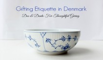
From my Copenhagen perspective, blue-and-white ceramics carry a particular kind of quiet confidence. A clear glaze can make the colour seem almost watery, while brush marks remain visible beneath the surface. On a wall plate, that depth changes the object from a simple blue accent into something with atmosphere: part coastal reference, part modern graphic art, and always closely tied to the Danish fascination with light, water and simple forms.
Danish ceramic wall plates with blue underpaint are especially appealing as gifts because they are decorative without feeling disposable. A hand-painted stroke might suggest a harbour, a flower or an abstract brush, but it does not need to illustrate a specific room. The plate can bring a calm note to a kitchen, hallway or reading corner, and its maker’s variations give each piece a sense of individuality. It is a gift with presence, yet it can still slip into an Australian home without demanding a total redesign.
Why blue underpaint feels distinctly Danish
| Underpaint look | Visual clue | Best fit in an Australian home | Gifting strength |
|---|---|---|---|
| Painterly cobalt | Visible brush strokes and tonal shifts | Coastal or art-led interiors | Distinctive and personal |
| Misty blue wash | Translucent gradients beneath a clear glaze | Pale timber and minimalist rooms | Gentle and versatile |
| Graphic border | Repeated shapes with a defined edge | Retro, eclectic or compact kitchens | Bold, even from a distance |
| Botanical flourish | Loose flowers, leaves and stems | Dining rooms and reading corners | Warm, familiar and decorative |
Underpaint is more than a blue colour scheme. It describes pigment laid onto the ceramic body and then covered by a transparent or lightly tinted glaze. During firing, the glaze becomes a glassy layer, softening edges and sometimes creating deeper pools of blue. Painterly pieces show tonal shifts and small overlaps; graphic pieces use controlled lines and repeated shapes. Both approaches can feel Danish, although the strongest examples avoid looking mass-produced and leave a trace of the hand.
When comparing pieces, look beyond the front image. Turn the plate over, check the edges for stray glaze and study the reverse for a maker’s mark, stamp or handwritten note. Those details can help distinguish a considered studio object from a general interpretation of Danish style. A slight asymmetry is not automatically a flaw, but it should look intentional. Also check the listed diameter, weight and hanging method, especially if the recipient rents and needs a removable adhesive hanger rather than a drilled hook.
Reading the maker’s hand
Blue underglaze rewards a closer look because the brushwork changes under the glaze. A dry-looking edge may become a fine dark line, while a pale wash can open into a clouded blue. That variation gives hand-painted stoneware its depth. It also explains why two plates photographed under the same light may look quite different in person, so clear condition photographs and a sensible return policy are worth seeking when buying from an Australian online retailer.
The motifs should have a reason for being on the plate. A spare arc, loose botanical line or softened horizon can feel confident; an overloaded pattern of flags, crowns and vaguely Nordic symbols can feel themed. Copenhagen design often draws from restraint and daily life, but Danish-made does not automatically mean minimalist. Traditional floral plates can be wonderfully layered, provided the painting is controlled and the glaze has the luminous finish you would want in a dining room.
When assembling a gift around one of these plates, consider the colour that already exists in the recipient’s home. If there is no blue, the wall plate can introduce it gently. If blue is already a major feature, choose a piece with a different blue weight: near-white, smoky, saturated or graphic. While searching for coordinating pieces, I also found coastal blue ceramics useful for seeing how a strong blue can sit beside softer, natural finishes.
Blue plates in Australian homes
Sydney homes give the palette an obvious setting: harbour light, pale plaster and white coastal interiors let a blue-and-white plate feel native to the architecture. Melbourne presents a different constraint. Narrow terraces and compact kitchens often have one clear vertical surface rather than a generous wall; a medium-sized decorative plate can therefore feel more useful than a large charger. In both cities, check whether the piece will be seen at eye level or across the room, since the underglaze reward depends on changing light.
Brisbane’s subtropical verandas and open-plan living spaces call for colours that remain fresh beside greenery and filtered light. Soft blue underpaint works well there, especially against timber, rattan or warm cream walls, while graphic dark blue can look crisp in a tiled kitchen. Perth’s sandy neutrals create another useful backdrop: chalk, stone and oat tones make the blue appear clean rather than cold, particularly in relaxed coastal homes.
Adelaide offers a useful lesson in scale because many brick homes and terraces have compact dining zones where one strong plate can carry more character than several small objects. At Australian design markets and independent gallery weekends, imported Danish pieces often sit beside stoneware bowls, prints and locally glazed mugs. That comparison matters: you can judge whether a blue underpainted plate brings genuine painterly character, rather than merely borrowing a familiar colour trend.
Australian gift customs also give the format plenty of room. A housewarming in Brisbane, a wedding in Melbourne, a retirement in Perth or a Christmas gathering in Sydney can all be marked with a useful object that feels personal rather than obligatory. Blue is an easy colour to share across generations, fitting an anniversary or a family home without tying itself to one person. A handwritten card explaining that the blue sits beneath a protective glaze turns a decorative choice into a small story about craftsmanship.
Matching the plate to the person
Match the piece to the person’s visual habits, not just to a room photograph. Someone who paints, sews or collects small art may respond to an expressive stroke; a person who prefers clean lines may choose a plate with a simple border; a keen cook may appreciate a piece displayed near the dining table even if it is not used for food. The underpaint should feel like an extension of their taste, not a style exercise imposed on them.
For someone leaving work, a plate can mark a change of pace without turning the gift into a joke about getting older. Pair it with a Danish memory journal and it becomes a prompt for photographs, travel notes and the stories behind a long career. For a new homeowner, the same plate could mark the first dinner, first house or first set of keys. In each case, the wall format allows the gift to remain personal after the wrapping disappears.
Practical gifting in Australia rewards a little checking. Confirm the diameter against the wall, ask whether the plate is intended for display or food use, and find out whether the maker supplies a hanging template. If it is shipped from Europe, allow room for the local delivery window and note that a replacement to another Australian city may take longer. Brown kraft paper, a simple Danish motif on the tag and a handwritten note can make the parcel feel special without hiding useful information about its origin and care.
Bring a blue accent home
For a keen host, the hosting platters in this Danish design edit make a useful companion to a blue wall plate: one object is for the table, while the other brings the palette into the room. That pairing suits the Danish custom of making food part of the décor, where useful pieces remain visible and part of daily life. Choose a platter with enough contrast to stand out against a pale table, and let the wall plate carry the quieter blue.
Before giving, read the maker’s notes and look for the small signs of care: even glaze coverage, a secure wall fitting and a mark that identifies who made the work. Ask the retailer about available colours and returns rather than choosing solely from a staged photograph. A blue that looks vivid on a screen may be softer in a warm Australian dining room, so requesting daylight images can prevent disappointment. The best gift is the version that feels right in the person’s actual space.
Choose the blue that recalls a quiet Copenhagen morning, give the plate a place where its brushwork catches the light, and let one small piece of Danish design become part of an Australian home. A blue underpainted wall plate is ready to carry a story, start a collection or simply soften one wall, all while leaving room for the recipient to make it their own.